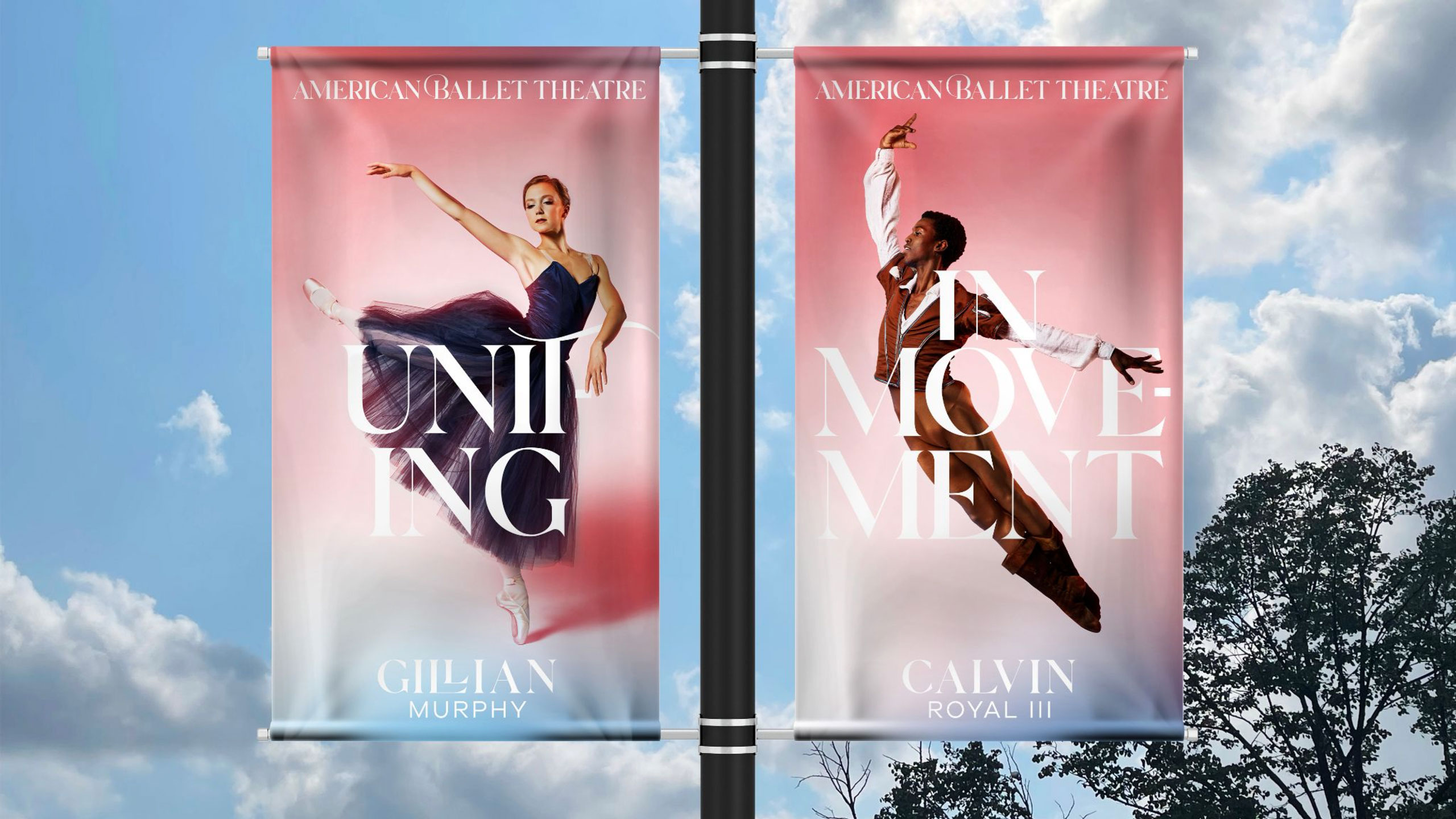
American Ballet Theatre, the iconic institution founded in 1939 is recognized as one of the leading classical dance companies in the world. To modernize the brand and maintain its cultural relevance, we positioned ABT as an approachable and accessible form of dance – highlighting ballet’s ability to unite people through movement.
The performing arts category overall is often perceived as exclusive and homogeneous. As a result, and as options for accessible entertainment proliferate, patronage is not often top of mind for many people. To combat this, ABT is embracing its heritage of being uniquely representative of America, as a ballet company that has often defied ballet’s courtly European past, the only major cultural institution that tours the United States annually, and being recognized as “America’s National Ballet Company” by the United States Congress.
The new design is meant to be dynamic, communicating constant change and evolution that feels relatable, with the idea of movement built into every element. This can be seen in everything from backgrounds born of the seven classical ballet movements, to dynamic type that enters and exits the screen like a dancer onstage.
THE IDEA
This new branding conveys the idea that movement, motion, and dance can bring us together in a beautiful form of self-expression.

THE COLOR STORY
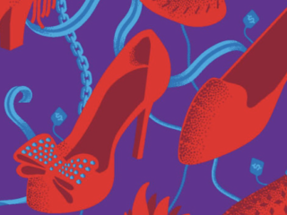
The color palette is a representation of what the American Ballet Theatre is built upon: American freedom and diversity of human expression.
Vibrant Reds – Express our passion and energy
Whites – Neutral colors such as white hues symbolize grace and elegance
Blues – Represent our unity, trust, and confidence
Together, these colors blend, move and transform to elegantly reference the core seven movements of ballet.

SAMPLE CONTENT